
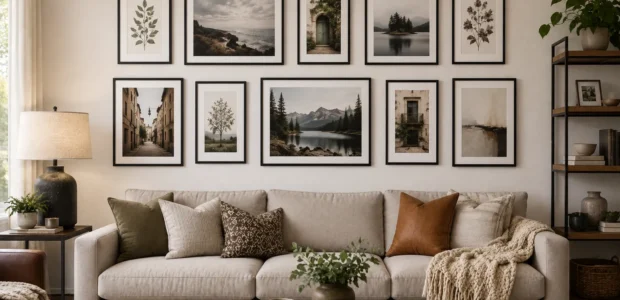

There’s a particular kind of blank wall that shows up in almost every living room, the one above the sofa that’s been empty for months, maybe years, waiting for you to finally do something with it. A well planned gallery wall might be the single highest impact, lowest cost upgrade you can make in that spot. It’s also one of the easiest things to get slightly wrong, which is exactly why a little planning goes a long way.
Let’s walk through real gallery wall ideas for living room spaces, plus a couple of tricks most guides tend to skip entirely.
Start With the Right Footprint
Before a single nail goes into the wall, figure out how much space you’re actually working with. A good general rule is to keep your gallery wall roughly two thirds the width of the furniture sitting below it, usually your sofa. Go much wider and it starts to feel disconnected, much narrower and it looks like an afterthought.
Once you know your footprint, trace your frames onto butcher paper or simply outline them with painter’s tape directly on the wall. Move the cutouts around until the arrangement feels right, then commit to nails only once you’re happy with the layout. This single step saves an enormous number of unnecessary holes.
Choose a Layout Style That Matches Your Room
There isn’t one correct way to arrange a gallery wall, but a few approaches tend to work reliably well. A grid layout, with clean, evenly spaced rows, suits modern or minimalist living rooms that already lean toward clean lines. Salon style leans the opposite direction, mixing different sizes, orientations, and frame finishes for a look that feels collected over years rather than bought all at once. If your space is narrower or sits above a long sofa, a horizontal line layout, with frames aligned at the same height, stretches the eye across the room and makes the space feel wider than it is.
The One Rule That Ties It All Together: Repetition
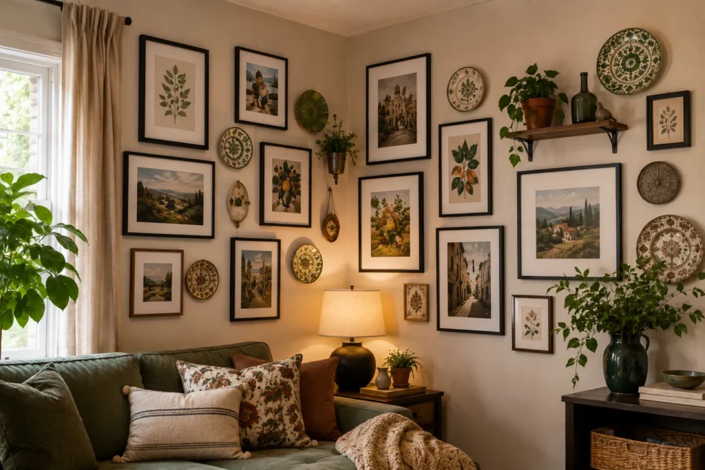
Here’s the trick that separates a cohesive gallery wall from a chaotic one, repetition. Repeat at least one element across every piece in your arrangement, whether that’s a shared frame color, a consistent mat width, or a recurring color that shows up in several pieces of art. That single thread is what keeps a mix of different sizes and styles from feeling like scattered clutter.
A simple example, all black frames paired with art that shares a similar tone or palette, instantly reads as intentional, even if the subjects themselves vary widely.
Get the Spacing and Height Right
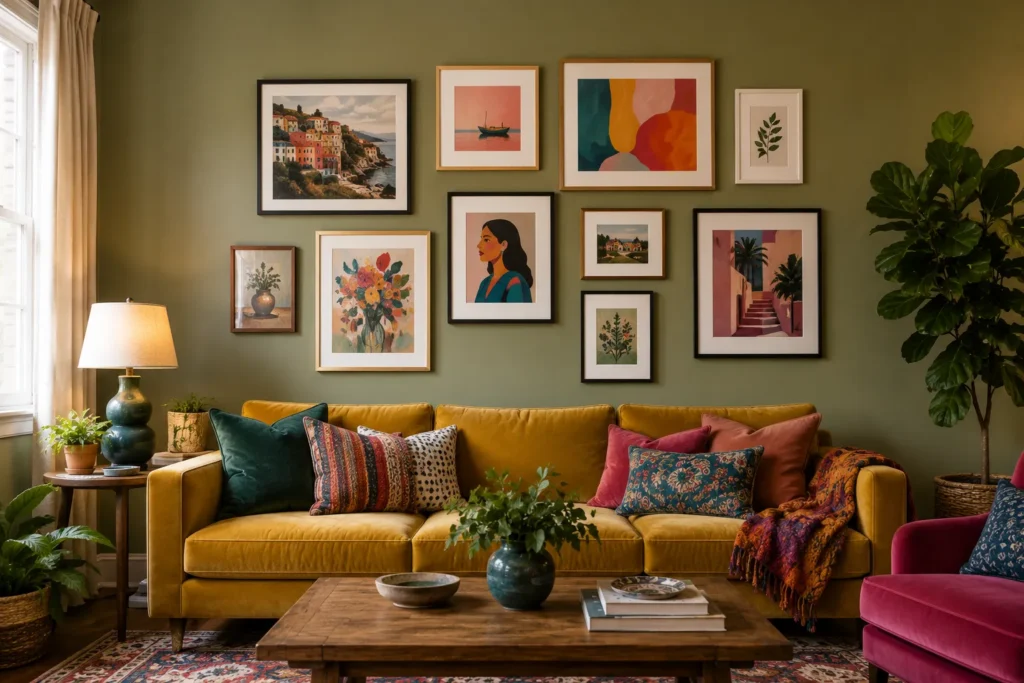
Consistency in spacing matters more than people expect. Aim for about 2 to 3 inches between frames throughout the arrangement, close enough to feel connected, far enough apart to let each piece breathe. As for height, most guides tell you to center your arrangement around 57 to 60 inches from the floor, the standard eye level measurement. What often gets left out, though, is that this number should shift slightly lower when there’s furniture underneath, so the gallery wall relates visually to the sofa or console beneath it rather than floating disconnected near the ceiling.
Read More: How to Style a Coffee Table Like a Professional Designer
What Most Guides Don’t Mention: Build It to Grow

Here’s a genuinely useful idea that rarely comes up. Instead of designing a gallery wall meant to look complete the moment it goes up, leave a bit of intentional space, room for two or three more pieces down the road. A wall that looks entirely finished on day one can start to feel static within a year, while one built with room to grow evolves naturally alongside your travels, taste, and collection.
A practical way to plan for this is using a modular hanging system, like a picture rail or a hook and wire setup, so adding new pieces later doesn’t mean patching old nail holes every time your collection grows.
Common Mistakes to Avoid
A few missteps show up again and again. Hanging everything too high, disconnected from the furniture below, is probably the most common. Skipping the layout planning step and going straight to hammering nails is a close second, since it almost always leads to extra holes and second guessing. And relying on too many similarly sized pieces without a clear anchor tends to leave the whole wall feeling flat instead of dynamic.
Once you’ve settled on a layout and style, sourcing the actual frames and art is where a bit of extra help pays off. If you’re shopping online for curated framed prints or unique wall accents, using a houzz promo code is a great way to lower your upfront costs. The Home Gardenist regularly features these discounts, coupons, and savings on home decor and wall art, making it easier to gather everything you need for your gallery wall without paying full price at every stop.
The Bottom Line
The best gallery wall ideas for living rooms really come down to three things, planning your footprint carefully, choosing one unifying thread through repetition, and leaving a little room for your collection to grow over time. Start there, and that blank wall above your sofa won’t stay blank for long.